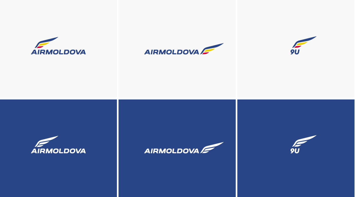
The old version of the logo, especially its text part, looked outdated, so there was made a decision to update it preserving the whole look and feel of the brand.
First of all we highlighted the elements we were not completely satisfied with and created the common outline of the inscription as a starting point, preserving the overall shape of the letters. All hand-crafted, without using any of the existing fonts.
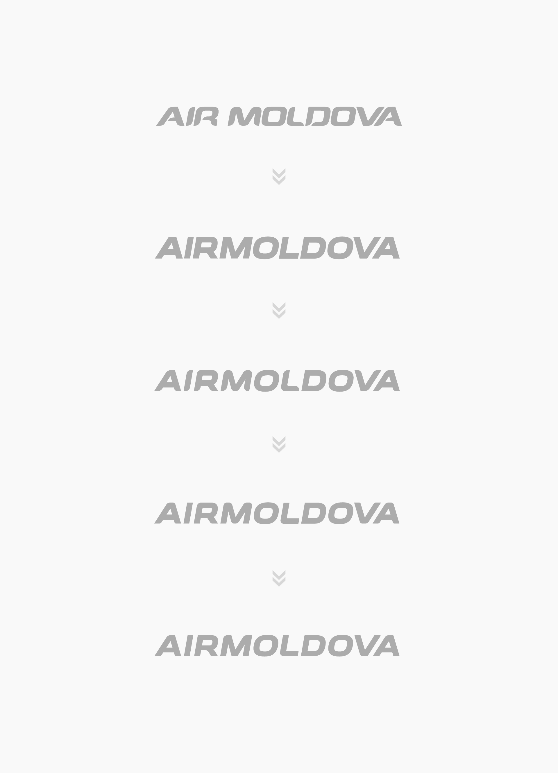
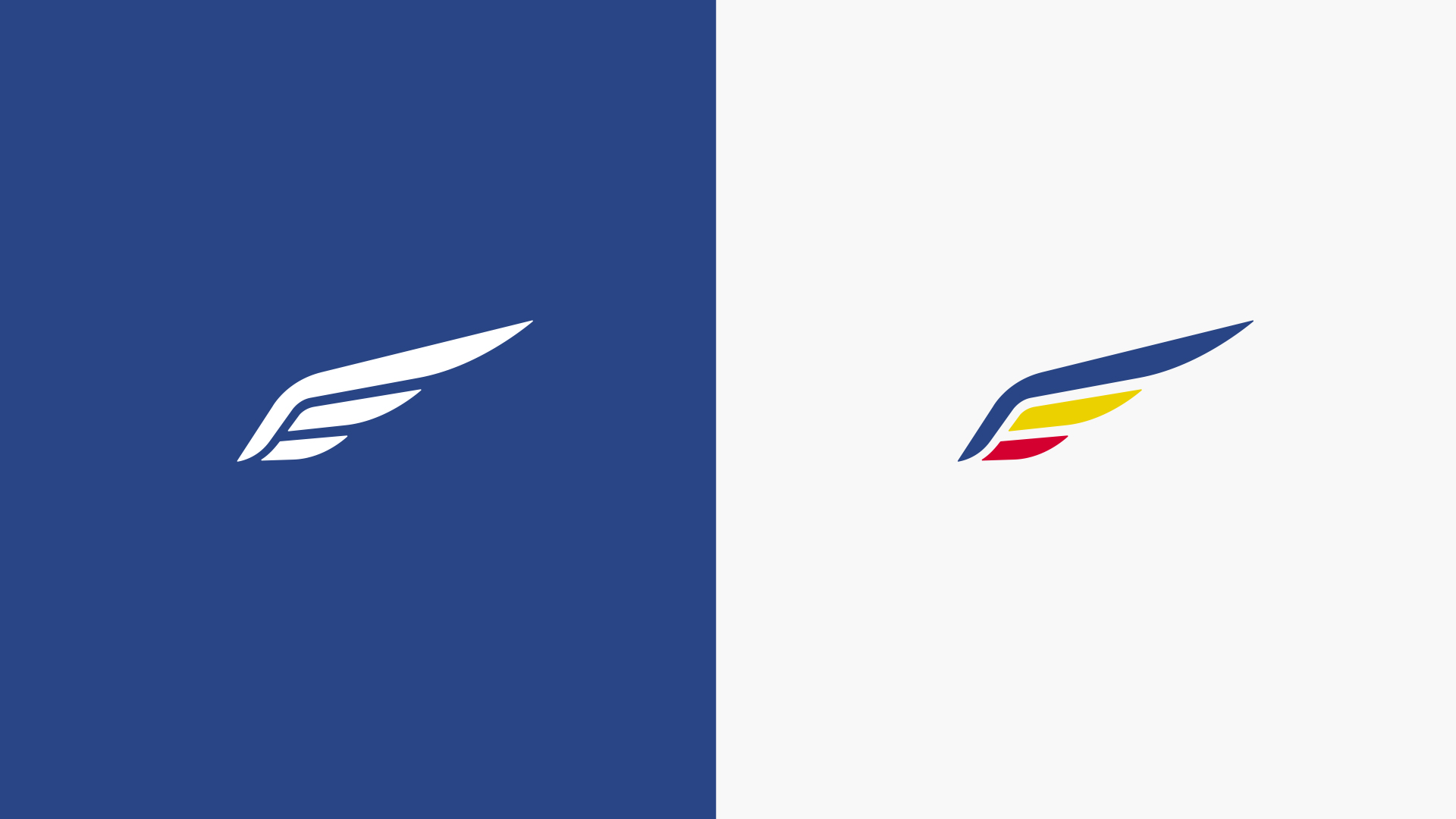
After several iterations we’ve got the final version of the inscription. The wing remained almost unchanged, it just got a bit smaller.
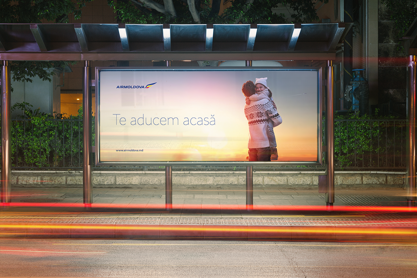
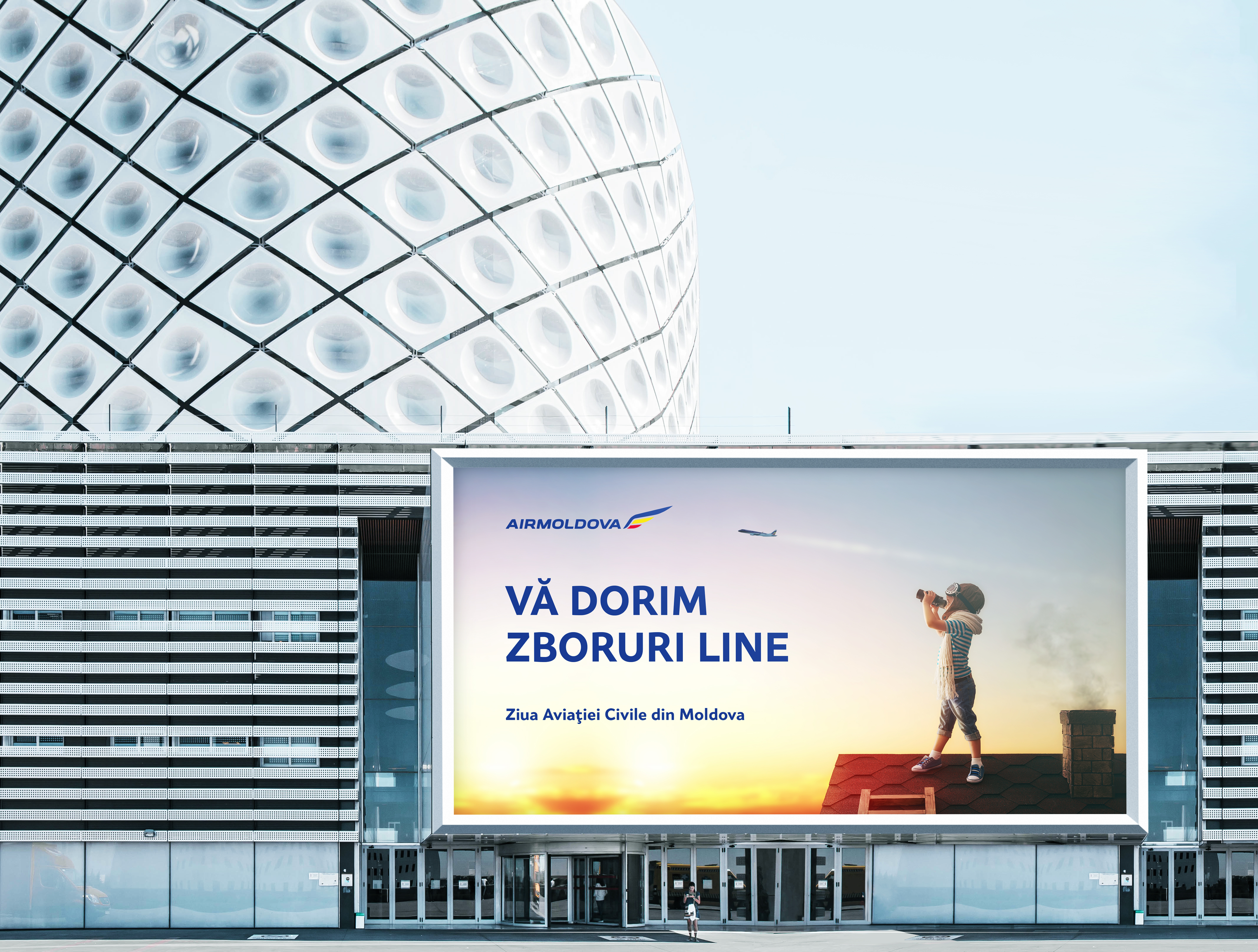
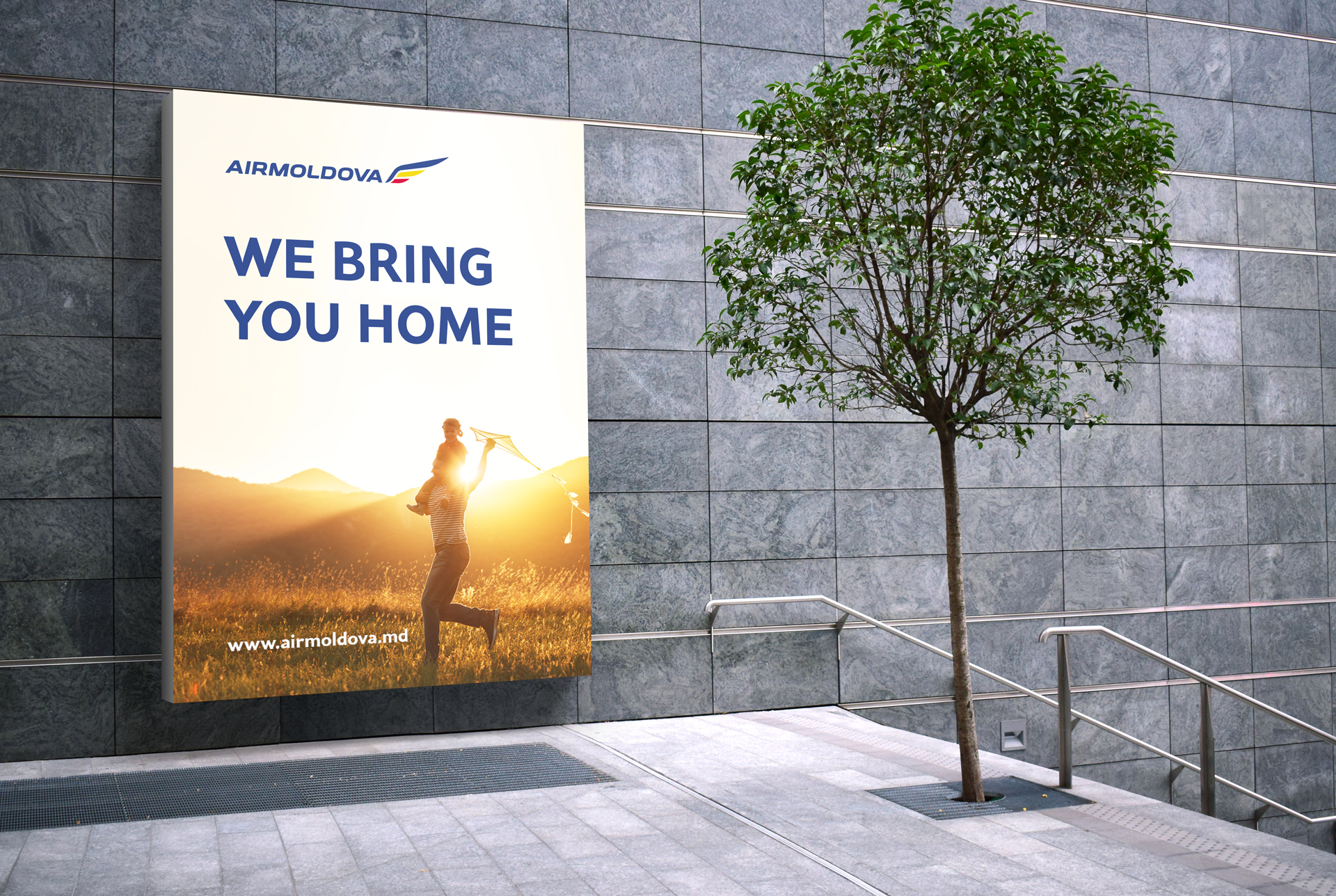
Agency: Publicis Moldova
Creative Direction: Eugen Boico
