Switching to Webflow
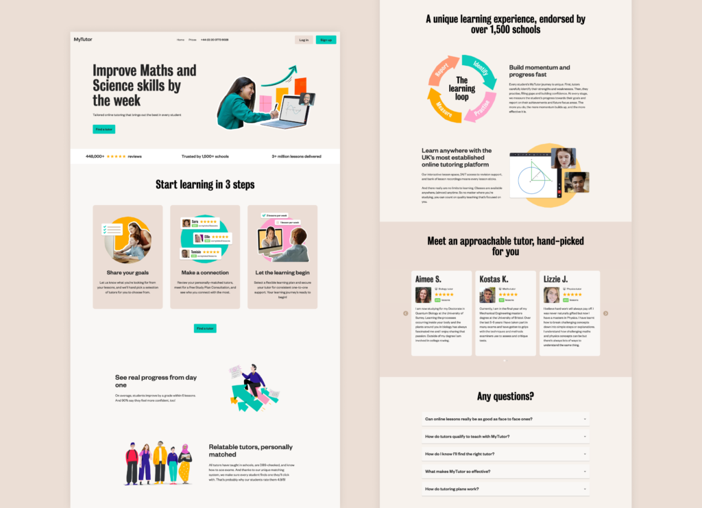
Initially, to design and build a new landing page, we combined the skills of a brand designer, a product designer, and an engineer. This approach led to extended delivery timelines and team members being overwhelmed with additional work. When I joined MyTutor, I decided to develop a more streamlined and consolidated method for delivering these projects. We switched to Webflow, and I took charge of both designing and building the pages with minimal help from the Product Design and Engineering teams.
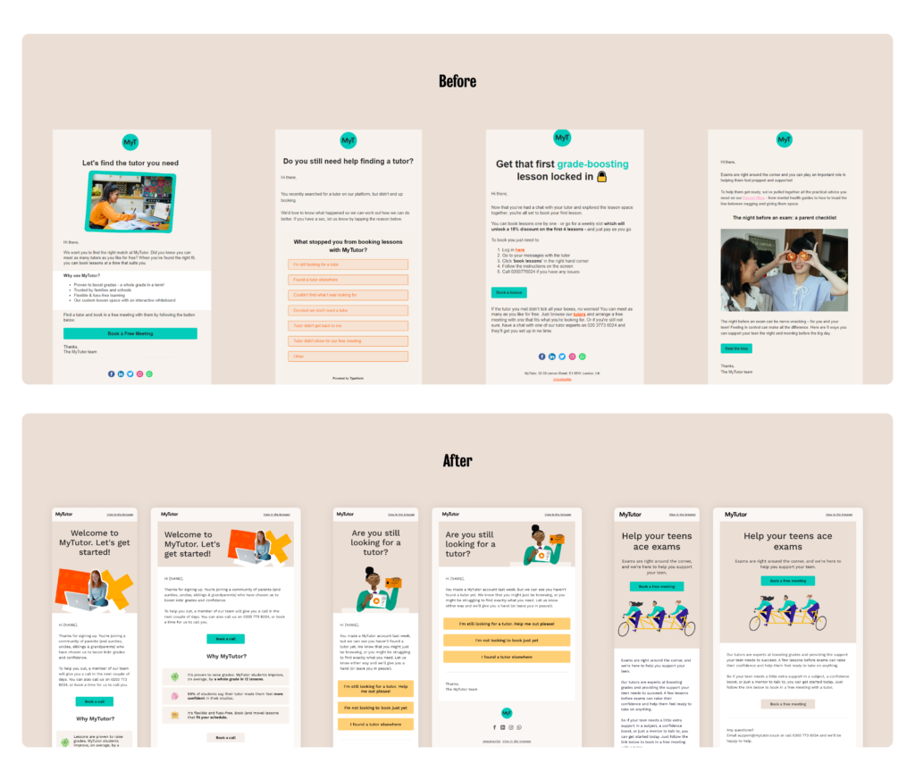
Working on our Webflow library also required us to review our email templates.
Built from a need
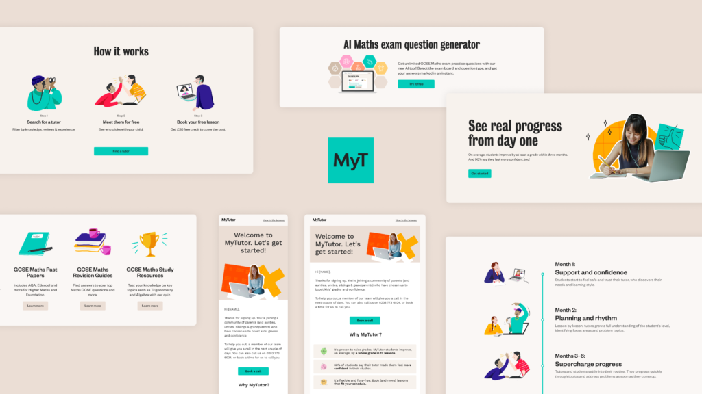
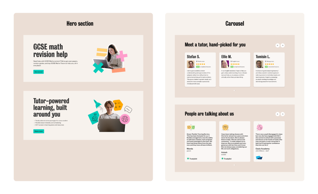
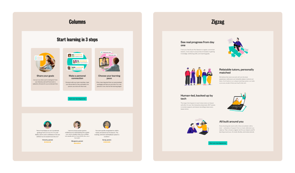
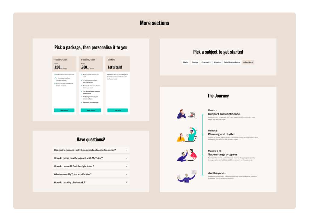
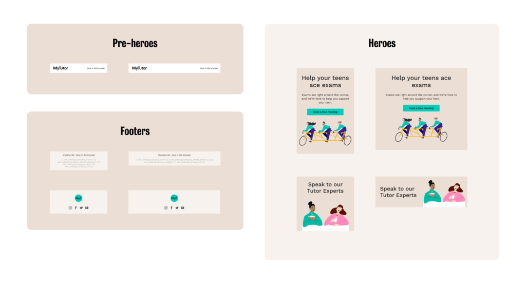
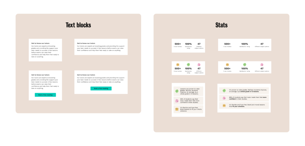
Once we started using Webflow to build landing pages, the library began to grow organically due to the marketing team’s need for new sections and templates.
We needed to rethink the Webflow and email content in a modular way to allow more flexibility and enable various combinations while maintaining a unique feel for each landing page or email and ensuring a cohesive look across all of them.
Optimisation is important
To save the Engineering team’s time, I explored ways to automate the transition of email designs from Figma to Hubspot. The best solution I found was using the Emailify plugin, which allowed me to both design and build the email templates in Hubspot without any additional help.
The challenges
For both the Webflow and CRM libraries, all sections needed to be developed to work well together. This way, they can be combined in various ways for different types of journeys, with options to transform them based on the needs of the specific page or email.
Our brand fonts, Bureau Grot and Founders Grotesk, aren’t Google fonts and can only be used on the web. For our emails, we decided to use the Google font Work Sans so that the emails can be coded. Coded type works better as it allows us to make it dynamic, perform extensive testing on the copy, iterate, and quickly optimize performance.
For the email structure, it was important to keep different screen sizes in mind. The pattern needed to shift smoothly from mobile to desktop, changing placement while keeping the code easy to build and maintain.
Key takeaways
The new Webflow and email systems are designed to provide more freedom for both the creative and marketing teams, offering options that can be switched on or off depending on the content. This approach also makes maintaining, updating, and ensuring consistency across all emails much easier.
As with any aspect of a design system, this side will evolve and expand over time. It’s difficult to predict all the ways the designs might be used in the future, but building flexibility into them from the start allows for greater adaptability as they are put into practice.